Wednesday, October 27, 2010

Print/ Video: Oil & Water Do Not Mix

 Designed by Anthony Burrill, created by Happiness Brussells, for the Coalition to Restore Costal Louisiana. 
Screen printed with oil from the Gulf of Mexico, limited edition of 200, 76.2 cm x 50.8 cm. Signed and numbered in pencil.


OIL & WATER DO NOT MIX from Happiness Brussels on Vimeo.
The song is by Queens of the Stone Age, "Make It Witchu".

What an idea! Belgian design collective Happiness Brussells conceived and United Kingdom-based  Anthony Burrill designed, taking action to raise money for the Coalition to Restore Costal Louisiana. New Orleans print shop Purple Monkey did the leg work.

The idea: use traditional screenprinting methods combined with the oil washing up from the Gulf of Mexico. I wonder about the toxicity of the oil (why weren't they wearing gloves, ack!), but it does look like they baked the prints at the end, so perhaps that sears away any nasties. At a whopping 150 Euro, these puppies ain't cheap (but, hey, neither are oil spill disasters, eh?). You can read more about the cause at Gulf of Mexico 2010.

More of Burrill's witty truisms can be seen below.

Anthony Burrill. Work Hard. Woodblock poster, open edition, signed in pencil, 51x76cm.
Printed by Adams of Rye onto 100% recycled sugar paper using traditional woodblock printing techniques.

Anthony Burrill. I Like It. Woodblock poster, open edition, signed in pencil, 51x76 cm
Printed by Adams of Rye onto 100% recycled paper using traditional woodblock printing techniques

Anthony Burrill. Temporary window designs for the Colette shop in  Paris.

Tuesday, October 19, 2010

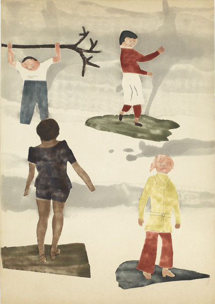
Artists: Mamma Andersson & Jockum Nordström

San Francisco's Crown Point Press just announced a new edition of etchings from Swedish artists and partners Mamma Andersson (b. 1962) and Jockum Nordström (b. 1963). Hot diggity, these are beautiful! Be sure to watch the short video below, released by Crown Point Press, of Mamma Andersson discussing the work.


I really love the subtle influences in tone and space of early 20th century French and Belgian artists (e.g. Vuillard and Ensor). This, combined with a decidedly mid-century modern figurative style and line, recalls the Chicago self-taught artist Henry Darger, as well as Chicago Imagist art, especially that of School of the Art Institute professor/ artist Ray Yoshida. The etchings at the bottom, Pieces and Faces, in particular, remind me of both Yoshida and Christina Ramberg.

David Zwirner (who also represents Chris Ofili) recently presented two solo exhibitions by Andersson and Nordström titled Who is sleeping on my pillow (both from 29 April–12 June, 2010). Accompanying the exhibition is what appears to be an amazing catalogue (of sorts), due to be released on November 30th. It was designed, sweetly enough, by the artists' son, Valentin Nordstrom, and is meant to be part monograph, part artists' book and part personal archive. It includes an interview with the artists, conducted by artist and illustrator Marcel Dzama.

More information about the background and other work of Mamma Andersson and Jockum Nordström can be found on Art Daily, as well at David Zwirner: on Andersson here, and on Nordström here.

Andersson/Nordström: Hunter, 2010
Color spit bite and sugar lift aquatints with aquatint and soft ground etching, 21½ x 28½"
Edition 30, Printer: Emily York, Publisher: Crown Point Press

Andersson/Nordström: Readers, 2010
Color spit bite and sugar lift aquatints with aquatint and soft ground etching, 21½ x 28½"
Edition 30, Printer: Emily York, Publisher: Crown Point Press

 Andersson/Nordström: Lou, 2010
Color spit bite and sugar lift aquatints with aquatint and soft ground etching, 21½ x 28½"
Edition 30, Printer: Emily York, Publisher: Crown Point Press

Andersson/Nordström: Surfers, 2010
Color spit bite and sugar lift aquatints with aquatint and soft ground etching, 28½ x 21½"
Edition 30, Printer: Emily York, Publisher: Crown Point Press

Andersson/Nordström: Pieces, 2010
Color spit bite and sugar lift aquatints with soft ground etching, 28½ x 21½"
Edition 30, Printer: Emily York, Publisher: Crown Point Press

 Andersson/Nordström: Faces, 2010
Color spit bite and sugar lift aquatints with aquatint and soft ground etching, 28½ x 21½"
Edition 30, Printer: Emily York, Publisher: Crown Point Press


Monday, October 18, 2010

Video/ Lit: How Ink (& a book) Is Made


via Christopher Hudgens at Bad at Sports.

While this ain't no Reading Rainbow video, it still is pretty nifty to have a context for the inks that we're surrounded by. Those velvety rollers and tubs 'o CMYK really make me drool. The featured business is from... can you guess? Canada! It's The Printing Ink Company.

Tangentially, I was wistfully reminded of a favorite children's story of mine that also happens to be a Reading Rainbow book, written by Aliki (full name Aliki Liacouras Brandenberg), called How a Book is Made. From 1986, it's a charming, educational insight into the writing, printing, and publishing process. I just love it when cute, well-dressed cats tell me all about books.


All images copyright Aliki and HarperCollins.

Interview: Julia Hendrickson on the Print Perspective

Kansas City-based artist and writer Matt Kuhlman interviewed me this summer for a printmaking blog called the Print Perspective that he's starting as part of his graduate studies. The site's pretty minimal so far, but he's got a lot of pieces planned (a write-up on Steve Walters' Screwball Press in Chicago is next). It's pretty neat that I'm his first subject.

Excerpts below:

I gathered a strong sense of surrealism from her work, but not in the typical means used by Dali and Magritte.  She creates such a tight focus on these small objects the viewer’s perspective shrinks down to that scale and causes them to ponder the importance of the objects. [...] Just about everything she makes is very cohesive [...] yet also very simply done as if it took almost no effort to get all the pieces to fall into place. [...]

It is truly rare to meet such a young artist that has accomplished so much and still has plenty of potential to spare.  She even understands the importance of balancing artistic ambitions with realistic needs.  “I’ve also been focusing a lot on other things lately, like cooking and reading and writing,” she told me on her back porch overlooking the picturesque garden below and a patchwork of rooftops fading into the distance.   She seems to know that the best results are achieved by combining several interests into a healthy balance of thought and action.  My advice would be to start paying attention to her now, because at the rate she’s going you might not be able to afford her work ten years from now."

Dang! Pressure's on! You can read the full text here. Our apartment looks much nicer now, artwork on the walls, even (perhaps I'll post some photos when I'm finished hanging the space). Yet, this all reminds me that I need to get/keep/stay crackin'.

Graduate school thoughts have been at the forefront of my mind and the tip of my scribbling fingers these days, but I'm also working on a few new projects, including: the exhibition of some new/ old work at Marwen's Art Fair 2010 (opening Nov. 5th); an upcoming collaborative screenprint (trillium and cotton blooms) with my southern belle, E. Stoutamire from Madison; a hopeful winter WWOOFing trip to Costa Rica; and a handful of silly, comic drawings for a new, secret, yet-to-be named zine with some feminist lady friends, which I can't wait to finish up and share.

Photograph taken by Matt Kuhlman (2010).

Wednesday, October 13, 2010

Review: Chris Ofili's "Afrotranslinear" / Arts Club of Chicago

Here's my recent Newcity review of Chris Ofili's show, Afrotranslinear, at the Arts Club of Chicago (201 E. Ontario St.), which is on view through December 22nd, 2010. Chris Ofili is represented by David Zwirmer in New York.

-------

(Oct. 11, 2010) After a splash on the London art scene in the 1990s, and an infamous controversy regarding elephant dung and former New York City mayor Rudy Giuliani, painter Chris Ofili quietly relocated to Trinidad in 2005 to remove himself from politics and focus on his art. The Tate Britain, which also presented Ofili with the prestigious Turner Prize in 1998, held a mid-career retrospective of his work earlier this year. With Ofili’s current exhibition, “Afrotranslinear,” The Arts Club presents a more specific survey of more than 100 works on paper created over the last decade.


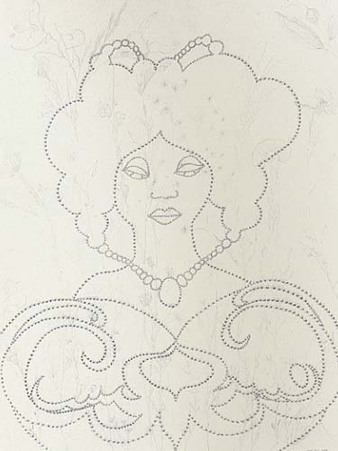
“Afrotranslinear” is the first Chicago exhibition of Ofili’s art, and his graphic, cartoonish figures present a 1960s and seventies style that aligns remarkably well with Chicago Imagist art. This may be the simplest, most restrained work of Ofili’s to date. As in his most recognizable paintings, his hand still strays toward the intricate and adorned. Yet, in his bright, flat watercolor portraits, and with a reduced palette in his graphite drawings, it is easier to notice the simple beauty and thoughtful humor in his work. With vibrant colors reflecting tropical Trinidad, Ofili’s lush watercolor portraits are crude in execution, yet purposeful in hue. Local flora is inseparable from the portraits, as the brightly patterned clothes seem to grow from the base of the page, flowering in the figures’ heads. The Arts Club’s choice to present solely Ofili’s works on paper is a significant one; they get all of the flashy, secret thrills of “that shit artist” with none of the obvious, immediate scandal.

Ofili’s musings on sexuality and race are most evident in his graphite drawings. The white of the page is primarily left untouched, against which his male and female figures are composed of simple, dotted lines; the tiny dots, upon closer examination, materialize as wide-eyed, afroed faces. Other drawings use these afro-dots in abstract, graphic compositions, the lines becoming hypnotic as undulating waves radiate from the tiny heads. Despite the predominance of the white page, Ofili’s afroed, black figures command the space, and the entire composition transitions into a representation of blackness. Ofili encourages such movement, as the title “Afrotranslinear” suggests: to see and appreciate an all-encompassing black, across and beyond the lines. (Julia V. Hendrickson)


---------------

Also, be sure to check out J. Foumberg's -ahem- tangentally and thematically-related review of the Rebecca Warren exhibit at the Renaissance Society. This may or may not have been dog-eared over at Newcity this week.

Sunday, October 3, 2010

Tamarind Turns 50

On the heels of my Chicago Printers Guild post, here's a tidbit from Sarah Hanley (at the excellent PBS Art:21 blog) about printmaking and the University of New Mexico's Tamarind Institute turning 50 this year. The traveling exhibit that occurs in conjunction with the anniversary looks like it will be quite good (including artists Vija Celmins, Kerry James Marshall, Philip Guston, Kiki Smith, Leon Golub, Jonathan Lasker, and Polly Apfelbaum).

Read the post here. A selection of new lithographs recently released from Tamarind follows (including some remarkably sweet prints from Laurent de Brunhoff... recognize the elephants?).

Nicola Lopez, Monument V (09-302)
 
Ten-color lithograph with collaged, hand-cut, printed elements. 22 by 18 inches, Edition 12.
Collaborating printers, Bill Lagattuta and Valpuri Kylmänen, at Tamarind Institute.
 
 Kiki Smith, Afternoon, 2010 (09-310)
Five color lithograph with glitter, 16 x 20 inches, Edition 24
Collaborating Printer Bill Lagattuta at Tamarind.

Laurent de Brunhoff
Dancing Elephants I- IV
A suite of four three-color lithographs, 8.5 by 11 inches each
Collaborating Printer Valpuri Kylmänen at Tamarind, Edition 25.

Exhibit: Chicago Printers Guild show opens Oct. 8th!

Please join me and a wonderful group of printmakers at the first-ever Chicago Printers Guild group exhibit, at the Chicago Urban Art Society (2229 S. Halsted St.), opening this Friday, October 8th, from 6-11pm! (through Sunday, October 17th). It will be a great survey of contemporary printmaking in Chicago. The press release follows.


The Chicago Printers Guild (CPG) was founded over a year ago, hell-bent on fusing together the tradition and success of its well-established print shops (including The Bird Machine, Delicious Design League, Sonnenzimmer, Crosshair, Screwball Press and The Post Family) with the creativity and flexibility of its up-and-coming studios (such as Spudnik Press and FugScreens Studios). Its first show since its inception, CPG hopes to do that and more, showcasing over 40 artists' collections and ranging in aesthetic and printing disciplines.

Serving as an introduction to the city of Chicago, the CPG show wants to take the viewer past the familiar settings when one thinks of print-making. Gig posters and t-shirts aside, this exhibition will illuminate the many disciplines within the printing medium: typeface, intaglio, lithography, even unconventional 3-D work will be included.

Chicago, with its rich print-making history, has a vastly dynamic community of artists which is constantly growing yet deeply rooted in tradition. The CPG is hoping to invigorate and engage the city of Chicago in order to promote print-making, as well as celebrate the vast array of artists taking part in this exhibition.

Participating artists: Angee Lennard, Billy Craven, C J Mace, Celene Aubry, Chad Kouri, Cherie Tymkiw, Dan Macadam, Dan Grzeca, Daniel Mellis, Diana Sudyka, Erin Page, Jason Teegarden-Downs, Jay Ryan, Jennifer Farrell, Jeremiah Chiu, Jessica Taylor-Caponigro, Johnny Sampson, Josh Davis, Julia Hendrickson, Justin Santora, Kathleen Judge, Keith Herzik, Kim Ambriz, Kwasi Amankwah, Kyle Baker, Lloyd Patterson, Megan Sterling, Michael Lauritano, Michael Schwindenhammer, Mike McQuade, Nadine Nakanishi, Nicholas Butcher, Phineas X. Jones, Rebecca Rakstad, Rich Kelly, Ryan Kapp, Sanya Glisic, Shawn Roberts, Steve Walters, Thomas Lucas, Veronica Corzo-Duchardt, William Sturgis, Zissou Tasseff-Elenkoff

On View:
Saturday, October 9, 2010, 1-5pm (printing demos!)
Sunday, October 10 2010, 1-5pm
Thursday, October 14, 2010, 6-9pm
Friday, October 15, 2010, 6-9pm
Saturday, October 16, 2010, 1-5pm (printing demos!)
Sunday, October 17, 2010, 1-5pm

Friday, October 1, 2010

Music: Mark Ronson & the Business Intl (plus, avenging bikes!)

Watch both of these:


Mark Ronson & The Business INTL "Bang Bang Bang" from Warren Fu on Vimeo.


Mark Ronson & The Business INTL: "The Bike Song" from Warren Fu on Vimeo.

A song about loyal bikes that fight back! Yes! Très élégant! Scott Schuman would have a field day.

This duo of dance-pop music videos for British producer/ DJ Mark Ronson's new project, Mark Ronson & the Business Intl, has seriously got me hooked. For what it is, the new album Record Collection is great, full of catchy, experimental dance tunes (you can stream the whole thing via Grooveshark/ Flavorpill here). I know I'm being sold something with these videos, but (kind of like in Mad Men), I'm buying the pitch--and the salesmen--more than the product.

Chicago-native Warren Fu directed, and I'm loving his work, too. The Guardian has a bio here. He worked at Lucas' Industrial Light & Magic as a visual effects art director for five years, so maybe that explains the retro-future vibe these videos have got going on.