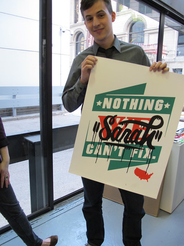
 Screen print, printed at The Post Family with help from Ina Weise.
The statement, the type manipulation, and the slyly silly gradation in the smiles on the faces, programmed by John Pobojewski, are all striking, and it made me want to know more about his work. Bud kindly agreed to answer some of my questions, and offered some interesting insights into his work, shared in italicized excerpts below.
 Bud holding an incarnation of one of Nick Adam's awesome We/ Us= USA prints at the Printervention opening.
Bud Rodecker, a 2007 Graphic Design graduate of the University of Minnesota-Duluth, ventured to Chicago in the summer of 2007 for an internship at Thirst, an internationally-recognized design collaborative. He's stuck around ever since.
What brought you to Chicago?
I came directly down from school for an internship at Thirst. How I got that internship is kind of a funny story. Rick came to lecture at my school my senior year. I shared some of my work with him, I also made a poster for his lecture. After his lecture was over I went up to him and said "I'm going to graduate in May and I'm going to ask you for an internship." To which he said "If you ask me I'll give you one." (Of course my professors had already set the stage for this) So in June I moved down to Chicago. After the summer I was lucky enough to stay on as a full time employee.
 Rick Valicenti lecture poster, found here. Poster is student design work by Rodecker, based on the cover of Valicenti's 2005 monograph "Emotion As Promotion", seen below.
I really focused on print design in college, but even then, like now, I did a little bit of everything. I remember Rick giving me critique when he came to visit, telling me I was really good at making images, but my typography was lacking. If something has changed it's been a growing emphasis on typography. You can actually see my old work here. Compare that with my new work, [and] you can probably see a difference. Plus I was a really sloppy designer in school, as is everyone I think.
If you really want a trip back in time, you can check out my time machine. I've been making websites since I was 14, and a couple years ago I collected them all in one place. There is a little caption below that tells when I did them. They're awful and I'm pretty embarrassed that I'm sharing them.
My photography [found here] has always played a role in my design and my creative output. It seems to be my go to when I'm looking to make some personal work, it also informs my sense of composition. Plus I love it.
How did you become involved with Printervention? Did you do the type for the poster, and do you enjoy hand-lettering type?
John Pobojewski was invited to participate in Printervention and he asked me if I wanted to do it. So we agreed to collaborate on a poster together. Our process involved brainstorming together and sketching out our ideas. [...] In fact, this drawing was the original inspiration for the background of the poster:
 March 12th, 2010 tear sheet, at RicharDaily.
John wrote a script to generate the faces in the background, they fill the space and go from no expression to smiling at the bottom. I used another script he had previously wrote to generate some faceted typography which I then tugged and pulled until it was just right. I do enjoy drawing letterforms, and I customize my typefaces whenever possible.
 AW font, collaborative design between Rodecker and Valicenti.
 Garland type face, collaborative design between Rodecker and Valicenti.
More and more I feel part of the design culture in Chicago. I've met lots of people over the past few years, and made some really good friends. The Chicago scene is so welcoming and friendly. Everyone is really happy lend a hand and share critique. I don't have much of a connection of design in other cities. I have a friend who works at Pentagram and I have lots of friends from school in Minneapolis, but that's as far as it goes. I do keep an eye on the work coming out of other studios though.
Can you talk a little bit about your RicharDaily project? Where did the idea come from? Is invoking the mayor's name political or just silly? Why sell the work?

The name is both a play on the mayor's name and my given name of Richard. It's also just goofy.
RicharDaily started as a way to kick me out of my laziness and get myself back into the creative mode. It seemed the right way to get me going again. Posting the items for sale gives me an extra incentive to actually make something real. If not I can quickly see myself ending up with a bunch of digital printouts. I have been selling a few pieces here and there. It's really great to have people get excited about my work and take it home with them.
Of course the work on RicharDaily relates to my 3st work. They can't help but interact with each other.
I was pretty inspired by Rick Valicenti’s Notes to Self project. Watching him make that body of work and working on the book and site for it really pushed me to want to make something. So here I am, making 365 things in 2010.
Rick Painting Some Notes to Self from thirst / a design collaborative on Vimeo.
Bud Rodecker discusses his contributions to the Curiosities show from thirst / a design collaborative on Vimeo. (Watch for his screen saver turning on around the 2:15 minute mark for a fun slide/side show).
This video shows Rodecker briefly discussing RicharDaily, in relationship to the recent retrospective exhibit Curiosities: Rick Valicenti and 21st Century Thirst, shown at Florida Atlantic University, February 13th-April 3rd, 2010. Check out photographs of the exhibit here. Rodecker's A Red and Blue America, varying edition of screen prints, as seen on RicharDaily here.
Those meshed Google street views (on RicharDaily) with your photographs of Chicago are interesting...
Thank you, I really like the google images. It's going to be an evolving series. I think it's an interesting collage of documentation of place and time.


